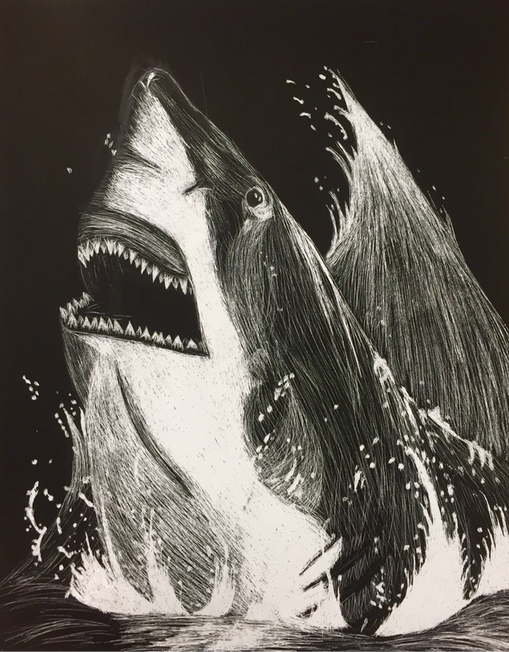
For the Scratchboard I decided to do a shark jumping out of water. After this project I am not a fan of Scratchboard. It was difficult to show the middle values, so most of my piece is black and white. The grey part of the shark ended up looking messy. My favorite parts are the teeth and the water droplets. Before I added all of the water it looked plain and needier a background. Overall I'm happy with how it turned out.
0 Comments
This project was supposed to be a self portrait with multiple faces. At first I had a picture of myself with random features like my mouth and eyes blown up, but it didn't end up looking good. After playing with the pictures I decided to section off two different pictures of my face. It was difficult to line up the features in my face, but I ended up putting a grid on the reference picture which helped. It was also difficult to do the shading in the hair. The third picture looked like a mullet until I went back in and added darker values. Over all, I'm really happy with how it turned out.
For this project I decided to draw cotton candy since the fair was this week. It was difficult to draw a hand holding the bag so I decided to put it on a stick. I wanted to draw the person on a Ferris wheel, but I ended up just putting it in the background. It was difficult to got the color in the hand to look right, and it was difficult to find a good color for the sky. I ended up just layering many different colors. This was challenging to do but I really like the finished product.
For this candy I decided to use prismacolors instead of chalk so that I could show more detail. I was happy with my use of different blues in the candy and on the jolly rancher logo. I likes the bright highlights on the center of the candy, but I don't like how the outer parts turned out. They don't look as 3D and realistic as the rest. If I could re do it I would go back and add more highlights and shadows to the outer edges.
For this project we drew Dum Dums. It was difficult to get the highlights to stand out so it looked dimensional. The hardest part was the words and designs. If I were to do it again I would add highlights and darks to the words so they look better. Working on this project helped me better understand how to work with prismacolors.
For this project we had to take pictures of eggs and draw them using chalk pastels. I decided to use blue for the eggs and orange for the back to make it stand out. It was difficult to do the shadows without using black so I ended up using blue and purple with only a little black. I decided to blend it to give it a smoother look and I'm happy with how it ended up.
For the perspective project I decided to do a guitar. I made it and interesting composition by foreshortening the neck and head of the guitar. It was difficult to make the metal knobs look like they were in the right position, but I just needed to add some more highlights and deepen the darks. When I finished the guitar it looked like it was missing something so I decided that I needed to add a background. Adding the hardwood floor made the piece look finished, and it also made the perspective look better.
For this drawing I drew a candy bar from life, unwrapping it as I went. I started by sketching out the general shape and laying out the words. One challenge I faced was correctly spacing out the letters and making sure they were tilted the correct way. I fixed this by laying it out with a ruler beforehand. Another challenge I faced was making the candy look rounded around the edges. To fix this I made the edges and corners darker, and used a kneaded eraser to make some highlights. If I could do it again I would go back and add more wrinkles to the wrapper. It was challenging to show all of the lines and shadows it created. 1. What challenges did I face and how did I respond? While working it was difficult to show the different values in the objects in front of one another. At first the skull and the tea kettle were the same shade, but I pushed my darks and worked on my shadows. 2. How did you use unique ideas? I was drawing from life so I wasn't left much room to be creative, but I did add and take away from what I saw to make an interesting picture. In the objects set up there was a pot and more flowers in the picture, but I decided to draw the bottle top instead. 3. Did you learn new techniques? Although I have worked with pencil before, this project gave me a chance to work on smoothly blending my values. First we worked with graphite and drew shapes and made a value chart. Next we started working with white prisms colors on black paper.it was harder to show shadows and dark values using white. Lastly I tried to show the value in fabric using color. The colors didn't turn out how I wanted them too so it isn't a realistic representation of the fabric. For my first contour drawings I did hands and tried to show all of the creases and wrinkles with continuous fluid lines. Next I did a contour drawing of the art room. I tried to draw Michael in the center, but I need to go back and add more details to his face. Last we did contour drawings of bookshelf. It was difficult to draw the lace in contour and to show all of the folds. |
Archives
December 2015
Categories |