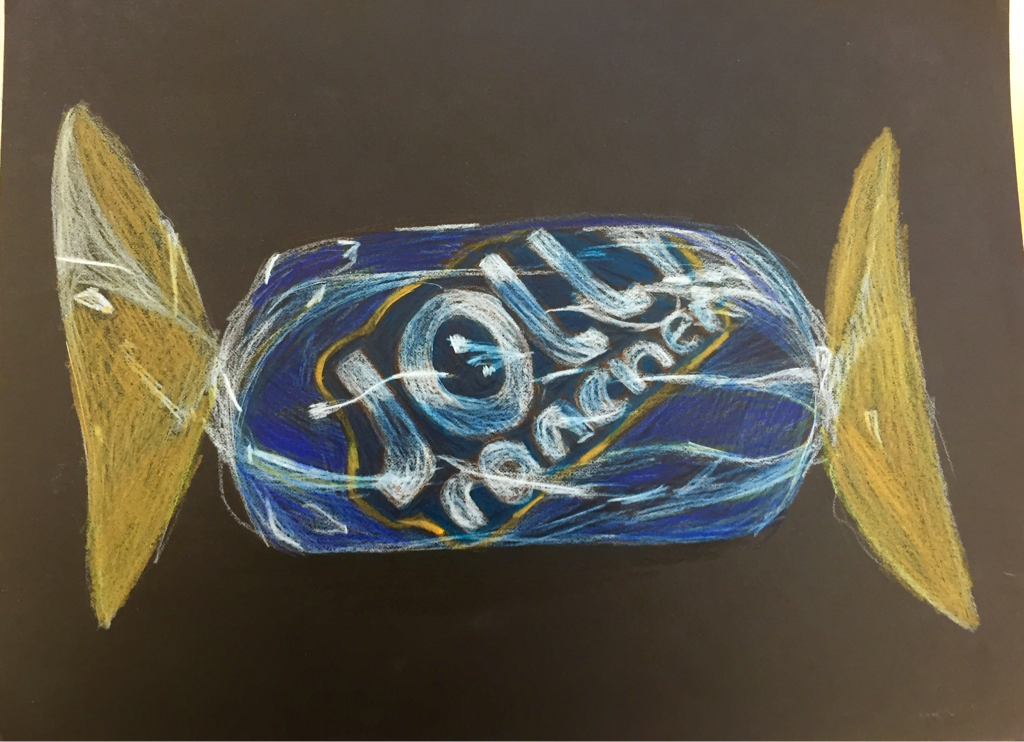
For this candy I decided to use prismacolors instead of chalk so that I could show more detail. I was happy with my use of different blues in the candy and on the jolly rancher logo. I likes the bright highlights on the center of the candy, but I don't like how the outer parts turned out. They don't look as 3D and realistic as the rest. If I could re do it I would go back and add more highlights and shadows to the outer edges.
