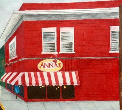
For my second concentration piece I wanted to do prismacolor just to see what I could do. I decided to do Anna’s pizza because of how colorful it is, and because it is on a corner which would make for a more interesting perspective. I started off by filling in all of the red on the walls, and going in with a red brown to use as shadows. Since you could hardly see the bricks in the photo, I decided to outline only some bricks instead of trying to measure out every brick so it looked perfect. The most challenging part of this piece was doing the blinds in the windows. The finished windows look fine, but I wish they were neater. My favorite part is the awning in front of the building. Instead of making the white panels white, they’re almost pink with red shadows. Other than the messy windows, I am happy with the finished piece.
For my first concentration piece, I decided to do an oil painting of the Halle in downtown apex. I took the photo I used as a reference as the sun was going down, so it made everything have a bluish tint. I started off by painting the outside of the Halle, but I later realized I should have done the back ground first. I’m happy with how the building looks, but I think I need to lighten up the sky or darken the building so they don’t blend together. I also need to make the sidewalk infront of the Halle a little darker so it looks like it was taken when it was darker out. The only other thing I need to do is pull more red through the piece so the building on the left doesn’t stand out. Overall I am happy with the way this piece turned out. I really like how the yellows and blues look and I am going to try to keep using those colors in my paintings.
For This project we had to draw a lifelike skeleton in detail. the purpose of this was to make sure that everything was in proportion. The first difficulty I had was with the skull. I couldn't get the shape of the eye sockets right, and i couldn't make the jaw the right size. I also struggled to make the mouth not look like it was smiling. It was also difficult to get the shape of the rib cage right. Overall Im not very happy with the way it turned out, but it did help me better understand the proportions of the human body.
For this project we had a classmate model while we drew them in charcoal. The point of the exercise was to draw loosely and avoid details. We were trying to get the shapes and proportions right. The picture on the right is my worst. The proportions are way off and so are the body shapes. It was difficult for me to do the less detailed drawings and just see the shapes. The one on the right is my best. While the head is still a little too big for the body, it is more proportional than any of the others that I did. this is because I took my time and payed attention so how big body parts were in relation to others. While doing these I realized it is hard for me to work loosely without making everything look messy.
|
Archives
February 2016
Categories |